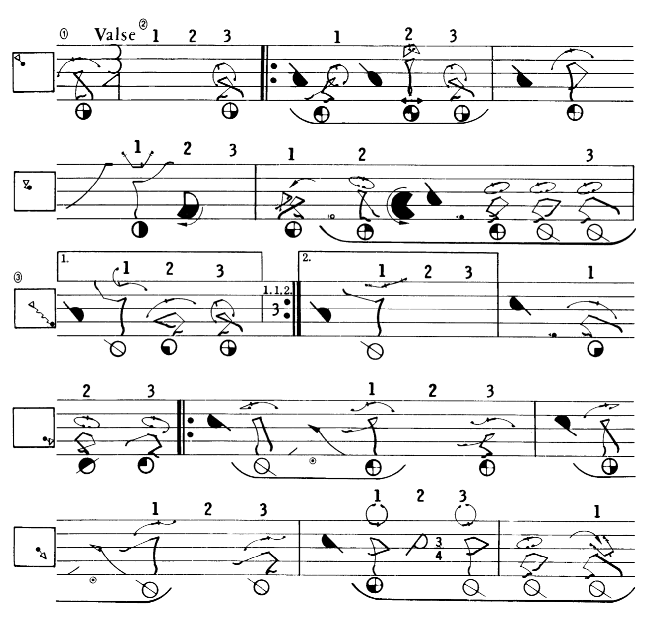
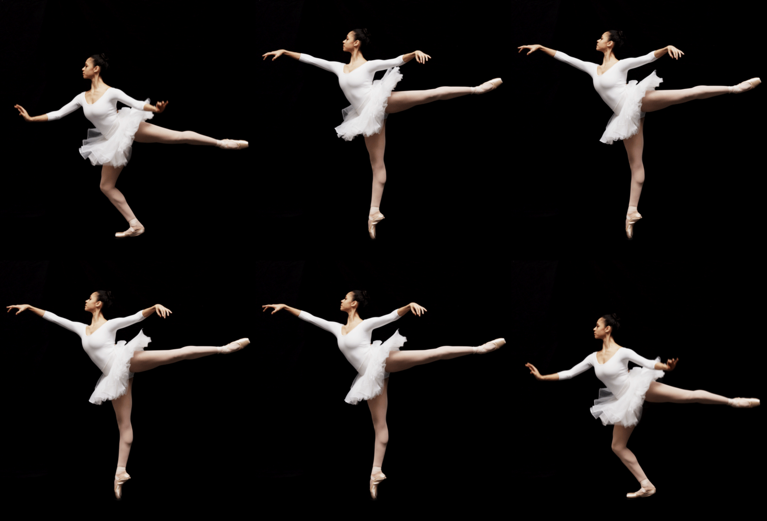
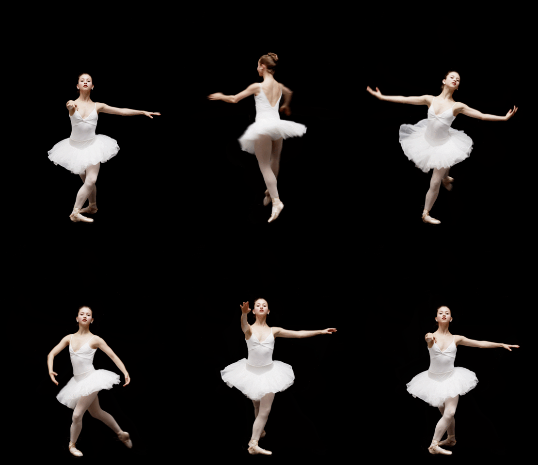
CHOREO is a variable display typeface designed by Dan Luo.
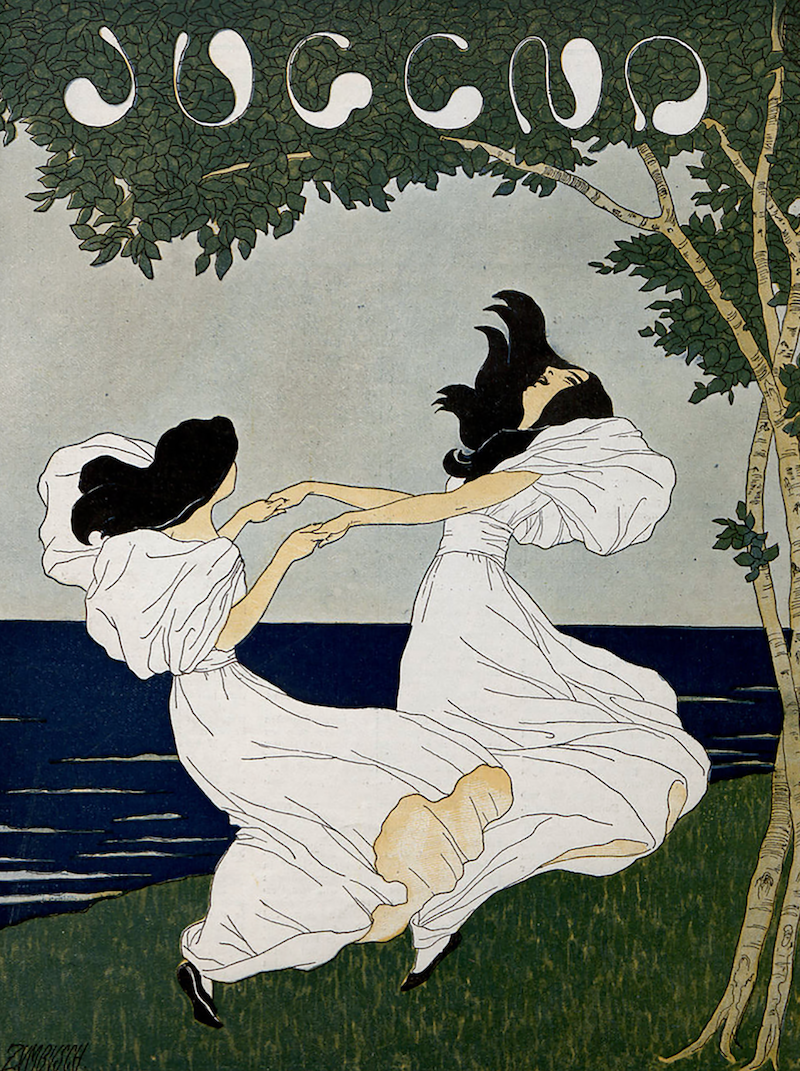
It was initially inspired by a cover of Jugend magazine, where two girls in white dresses hold their hands and dance by the water. The six letters on the top are perfectly in tune with the scene as if dancing on tiptoes with dresses billowing around. This set me thinking about creating a typeface that expresses dancing in writing.
Though using Jugend magazine as a starting point, the design gradually departed from it. Each letter was drawn with only one line without exception and became more expressive by flanking the letters’ arms outwards and allowing intersection within one stroke.
While maintaining the sharp contrast between thick and thin strokes, the design is closer to script typefaces by capturing the speed and habits of handwriting. Readability was largely improved, since in Jugend magazine’s six letters, the letter E can only be read as C without the context.
